Try interacting with the
data visualisations below
A computation design centred project utilising data visualisations and interpretations produced through Javascript, Html and CSS. Explore the trends and changes in the global and regional wildlife population. Using the Living Planet Index, a metric that measures the state of global biological diversity based on population trends of species from different continents around the world.

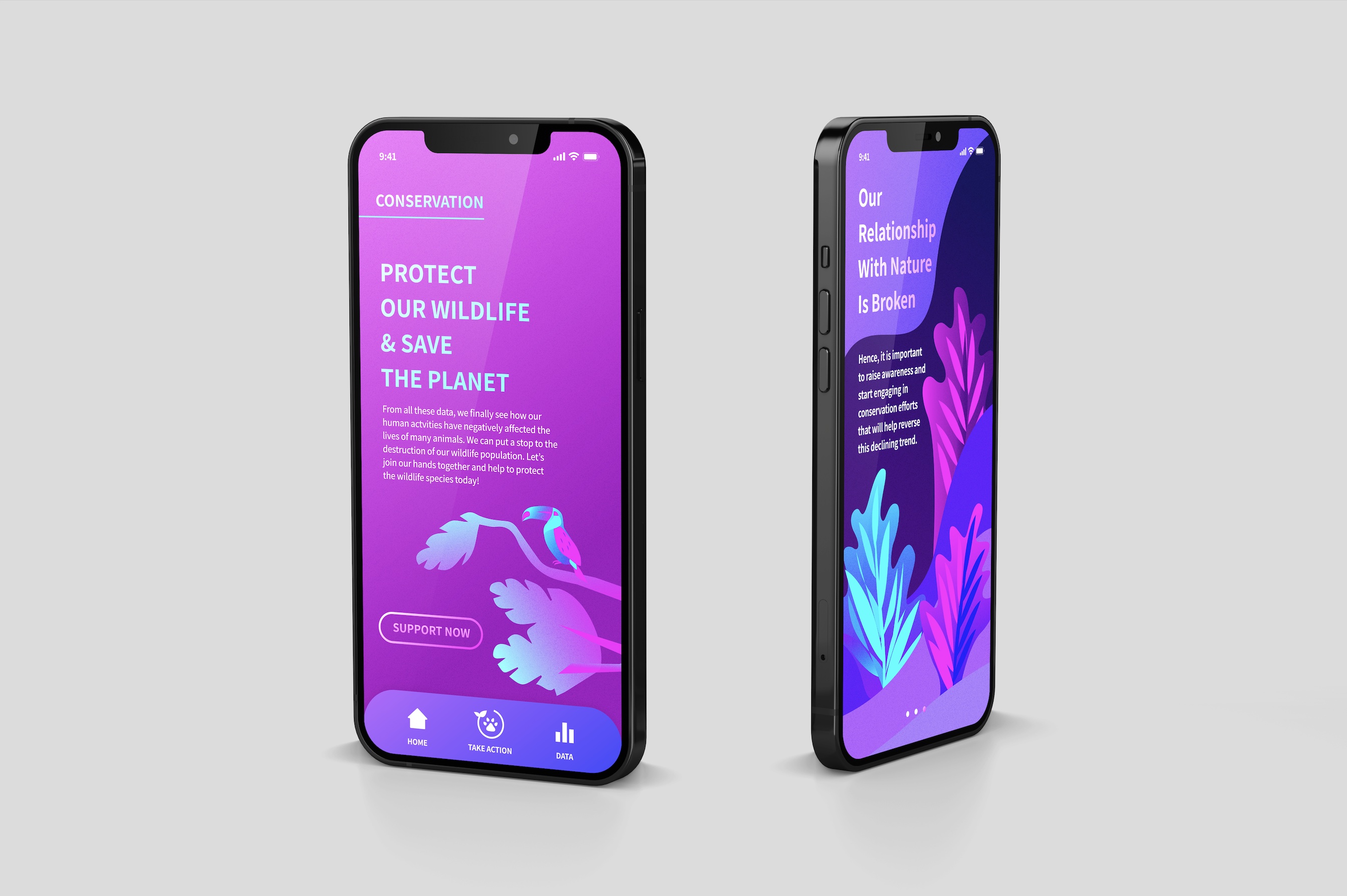
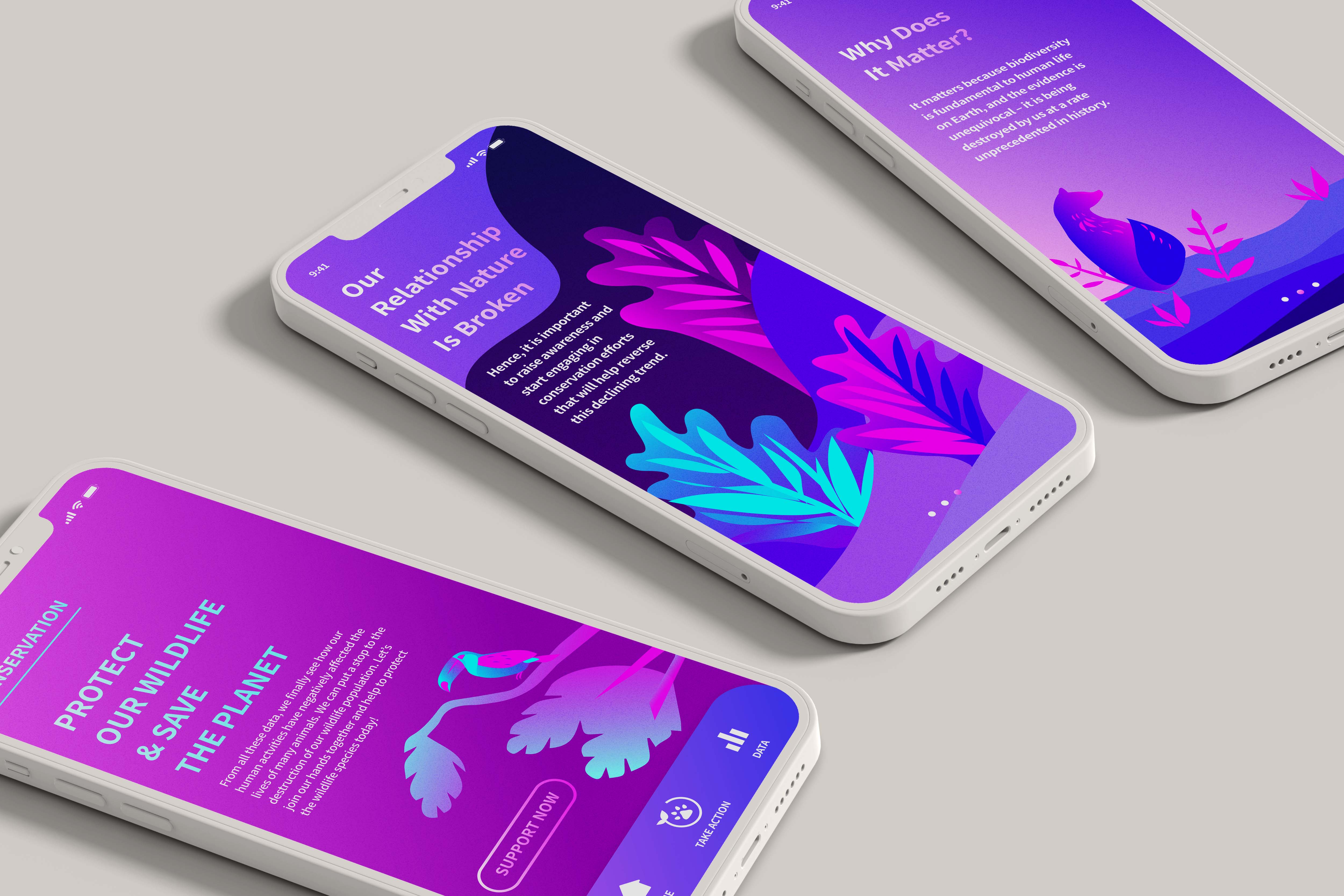
An experiential artefact that explores the effects of human activities on wildlife populations and the Earth.
The artefact is based on the insights and conclusions that were derived from both datasets - the Living Planet Index and Threats To Wildlife. The artefact visualises the idea of 'The Dying Planet' through an interactive experience that raises awareness of the fragile wildlife population on Earth. The artefact is made up of ellipses that come together to create a sphere that represents the planet, Earth. The individual ellipses represent each wildlife species that forms life on Earth.
The artefact's interactions reflect the effects of human activities on the wildlife population. When the mouse is moved, the ellipses forming the planet scatters away, leaving Earth destroyed and lost. However, if the mouse stays put, the ellipses rebuild the shape of the planet again. This interaction visualises the effects of the threats to wildlife. In this sense, the scale of movement by the mouse symbolises the severity of destruction made. These threats destroy life on Earth, but if the threats are reduced or stopped, wildlife populations can repopulate Earth again. If the mouse is pressed, the ellipses will be colourised to symbolise a healthy and idealised state of Earth. Metaphorically, this interaction portrays how supporting wildlife conservation efforts, brings back life to the once dull-looking planet. When the mouse is let go, colour vanishes from the Earth depicting the absence of wildlife protection, as a result our wildlife populations are susceptible to destruction again.

Above–Interactive Map Visualisation
Below-Line graph visualisation with mouse hover and press interactions
The data is visualised through a map using population density as a way to portray the LPI percentages in a visual format. Each continent is made up of ellipses that represent the wildlife population present in the region. As the user moves the mouse across the screen, the map displays the changes in wildlife population density across the different years. We can see from the map visualisation some continents are less dense while others are much more crowded with ellipses, which provides a distinct visual comparison between masses from different parts of the world.


Data on Threats To Wildlife is conceptualised through illustrations of barren trees to reflect the devastating effects it has on nature and wildlife species.