This is a rebranding project for a multi-generational hawker store. A hawker in the Singapore context is someone who sells food. In the old days, this was from a roadside stall or a pushcart. These days, hawkers can be found in coffee shops, hawker centres, and food courts (airconditioned hawker centres). Hawkers usually specialise in a particular cuisine, sometimes in just one dish.
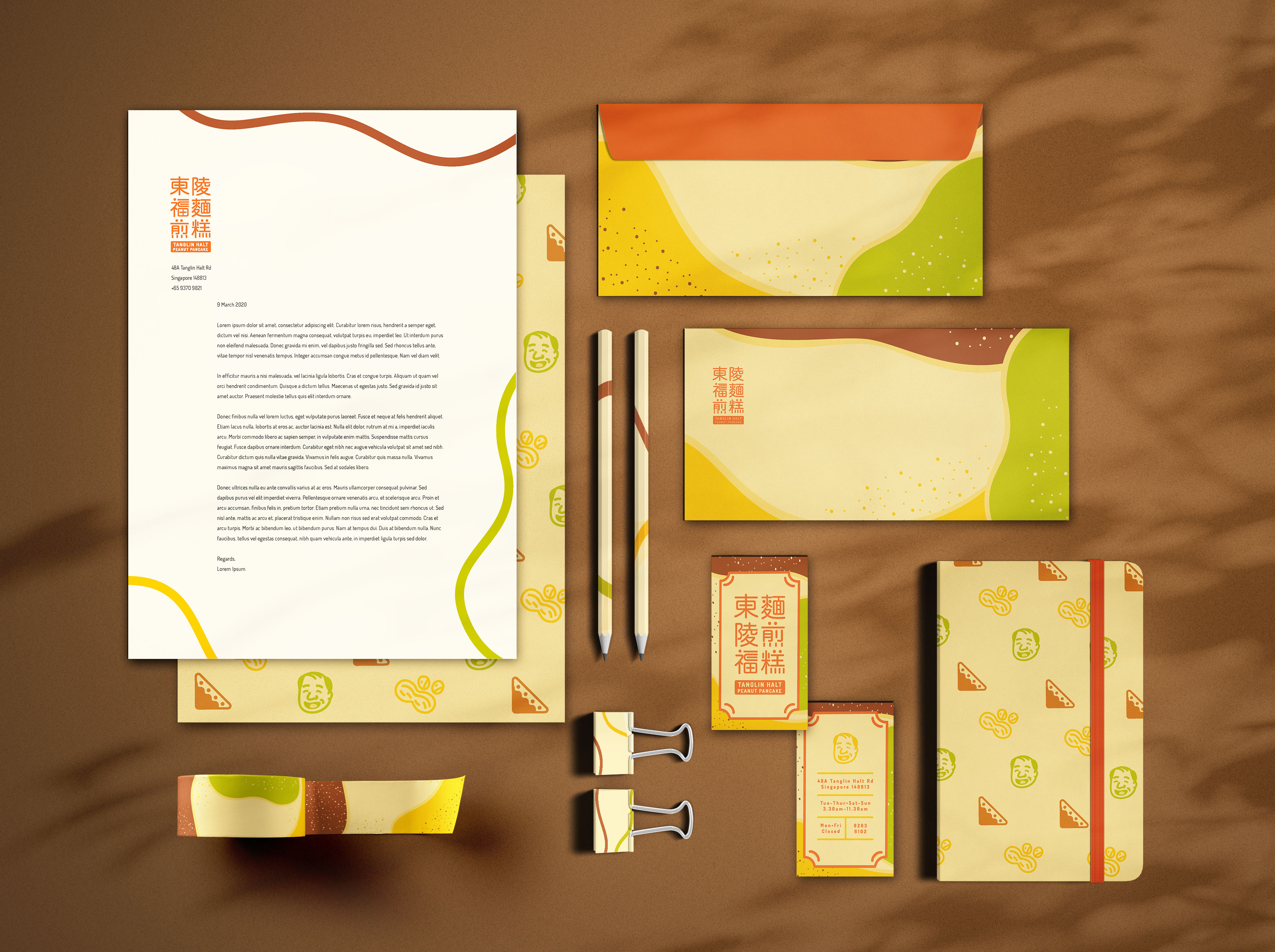
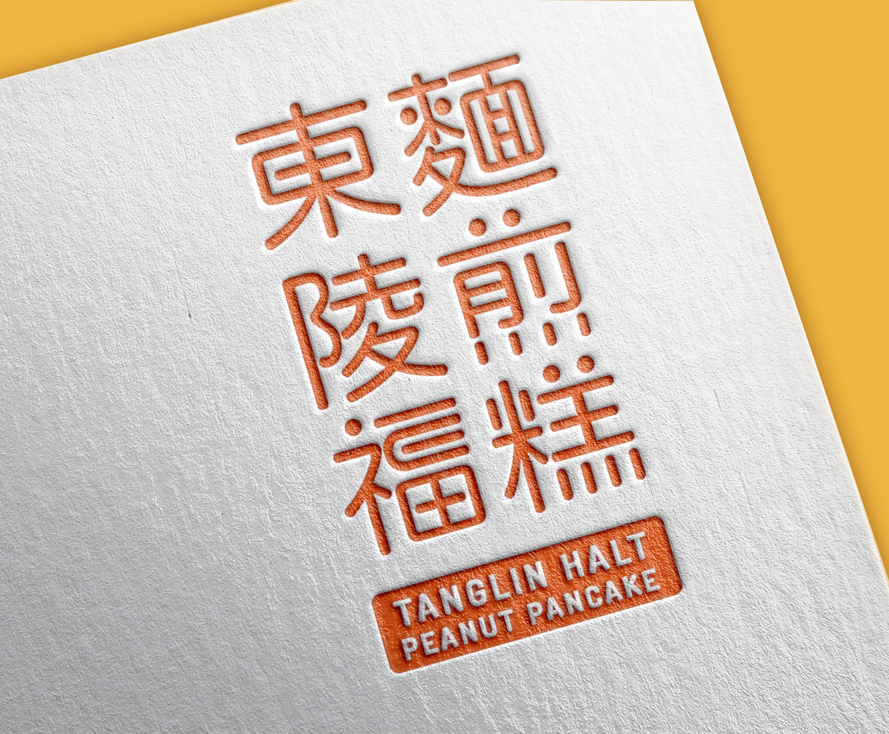
The wordmark is a handcrafted typeface to symbolise the friendly and joyful personality of this brand. The use of traditional Mandarin not only adds to the originality of the brand but also represents the long history of this brand and gives others a glimpse into the background of this brand. The icon of a peanut pancake can also be found in the wordmark. The wordmark adopts a rounded typeface to appear youthful, together with the traditional Chinese characters. this creates a balanced approach towards multi-generational target audience, from young to old. This builds on to the idea of being traditionally original in its craft.


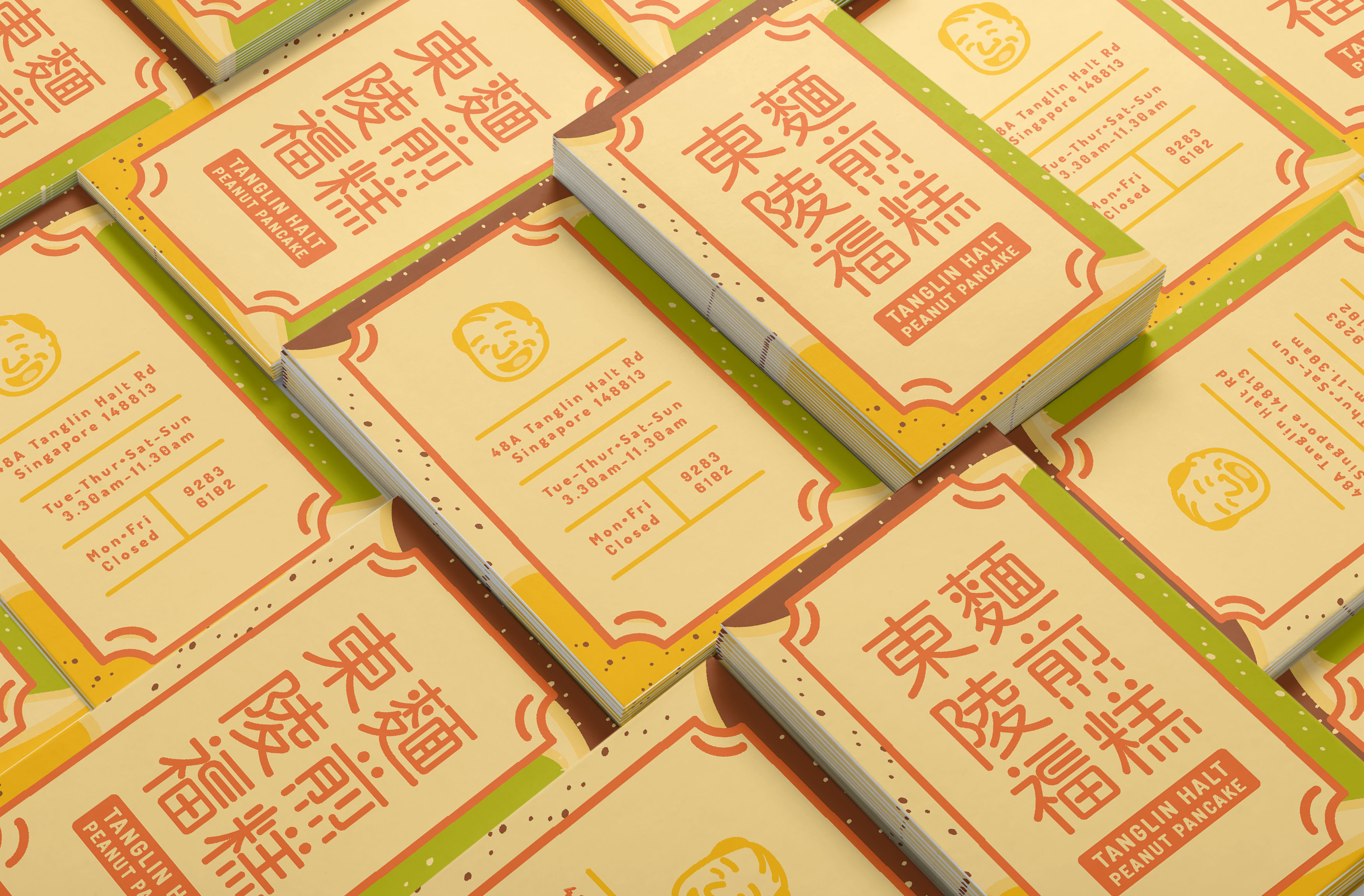
The symbol for the logo utilises an illustration of the uncle who runs the peanut pancake store. His face is used as the symbol/mascot for this brand as he plays the most prominent and important role in this brand. He is the owner and the cook that leaves the greatest impression on the patrons because of his friendliness and his professionalism and passion for his work. His facial features such as his hair, nose and smile, are also very iconic which plays a part in leaving a memorable impression on the patrons.
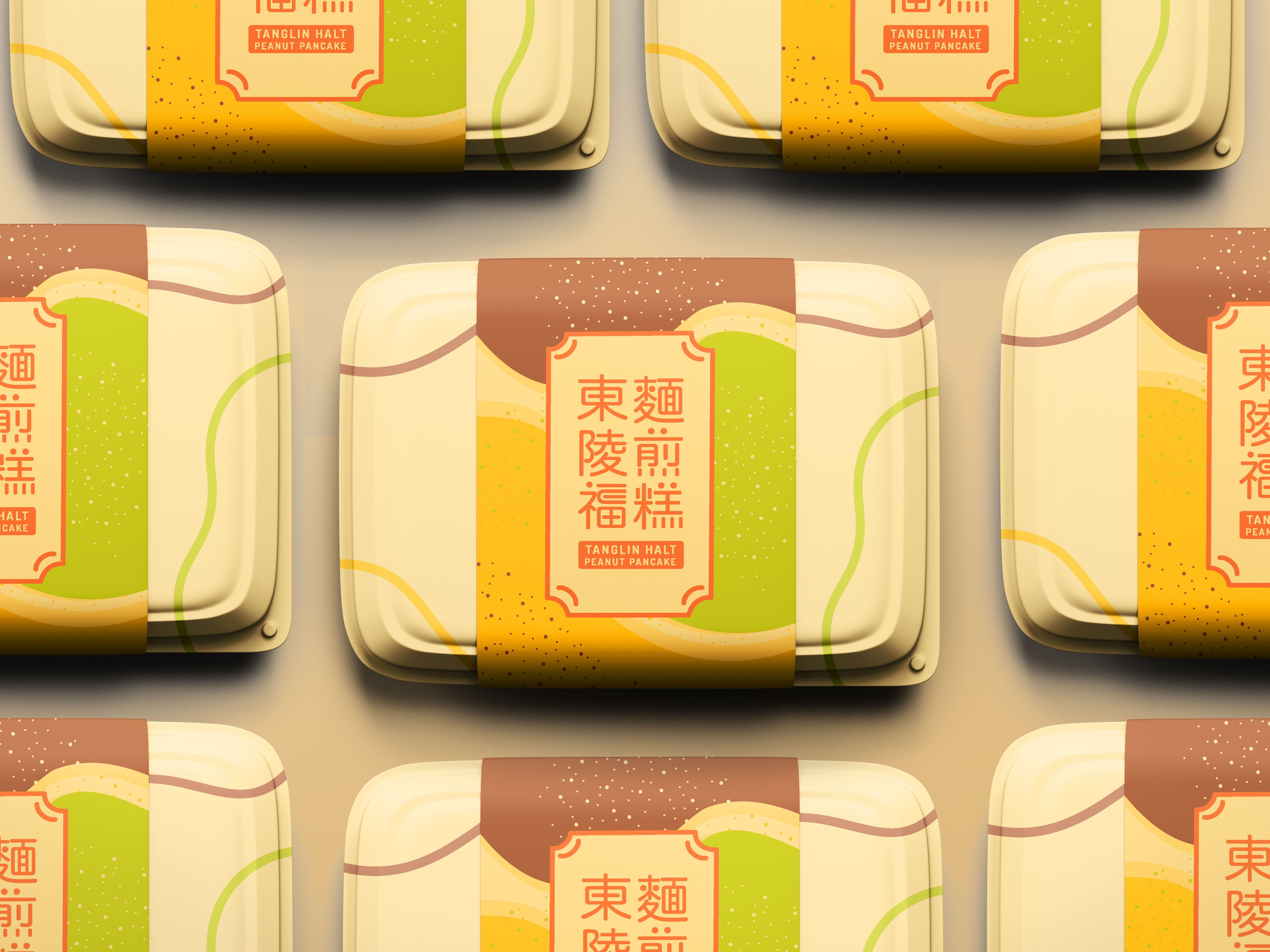
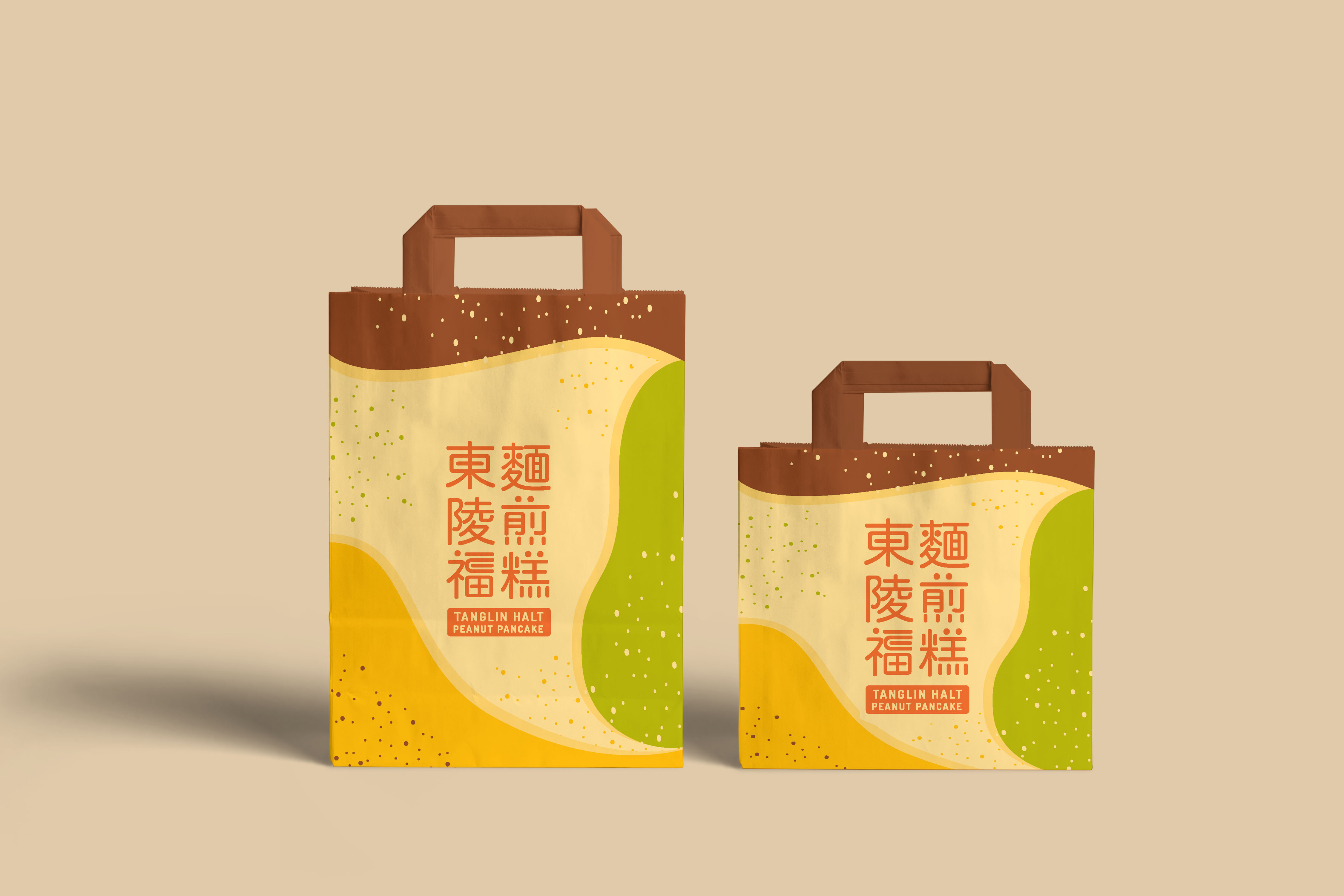
The brand colours are brown, yellow, green and orange. These colours reflects the appearance of the peanut pancake dish. The design also appeals to the youth who are still unfamiliar to the brand. The colourful graphics attracts the attention of its patrons which encourages them to purchase.
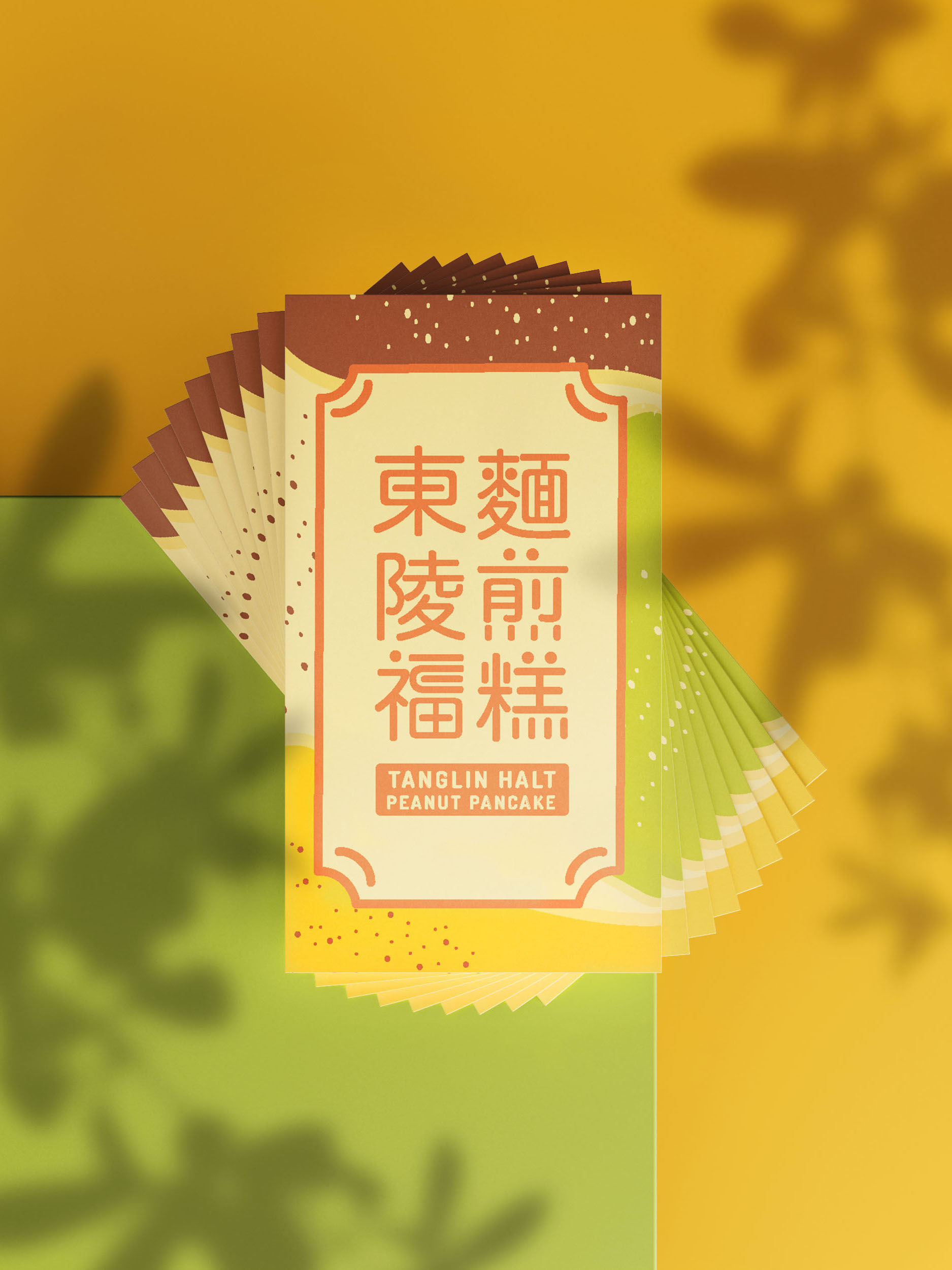

For brand applications, I proposed more ways of takeaway packaging for the food. Having a variety of packaging types and sizes allows for customers to carry and eat pancakes with ease and comfortably. Furthermore, packaging with the store's branding and design on will reflect the brand identity and bring the brand to life. Packaging creates a unique experience for the customers as well. The logo when used with the secondary graphic design, can be complemented with a border which creates a structured form to retain the traditional look of the brand. Having a border also draws the focus to the logo which makes it stand out when placed with the secondary graphics.