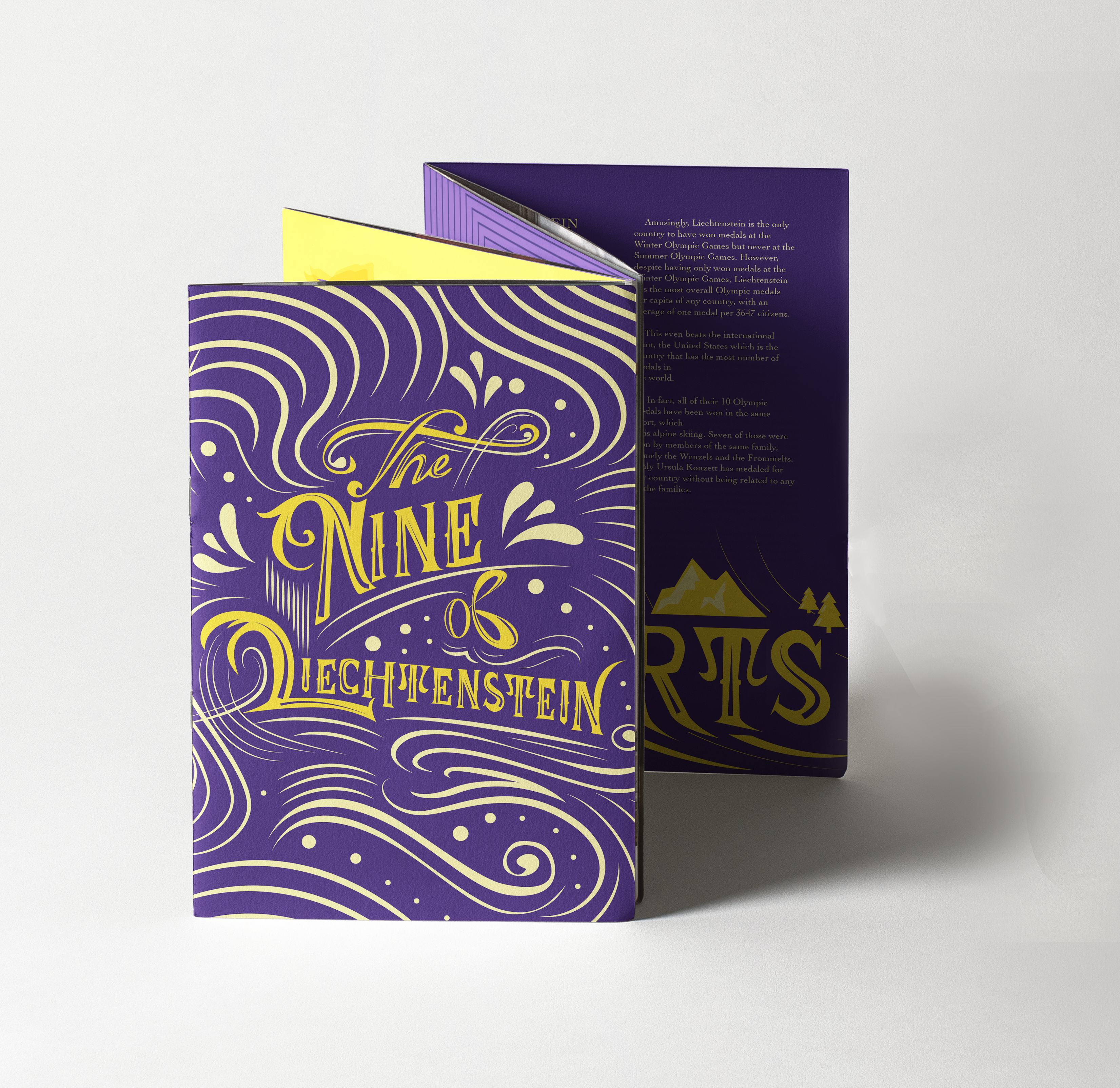
Publication Specifications:
Maple White 250GSM
Eight-fold A 2Poster
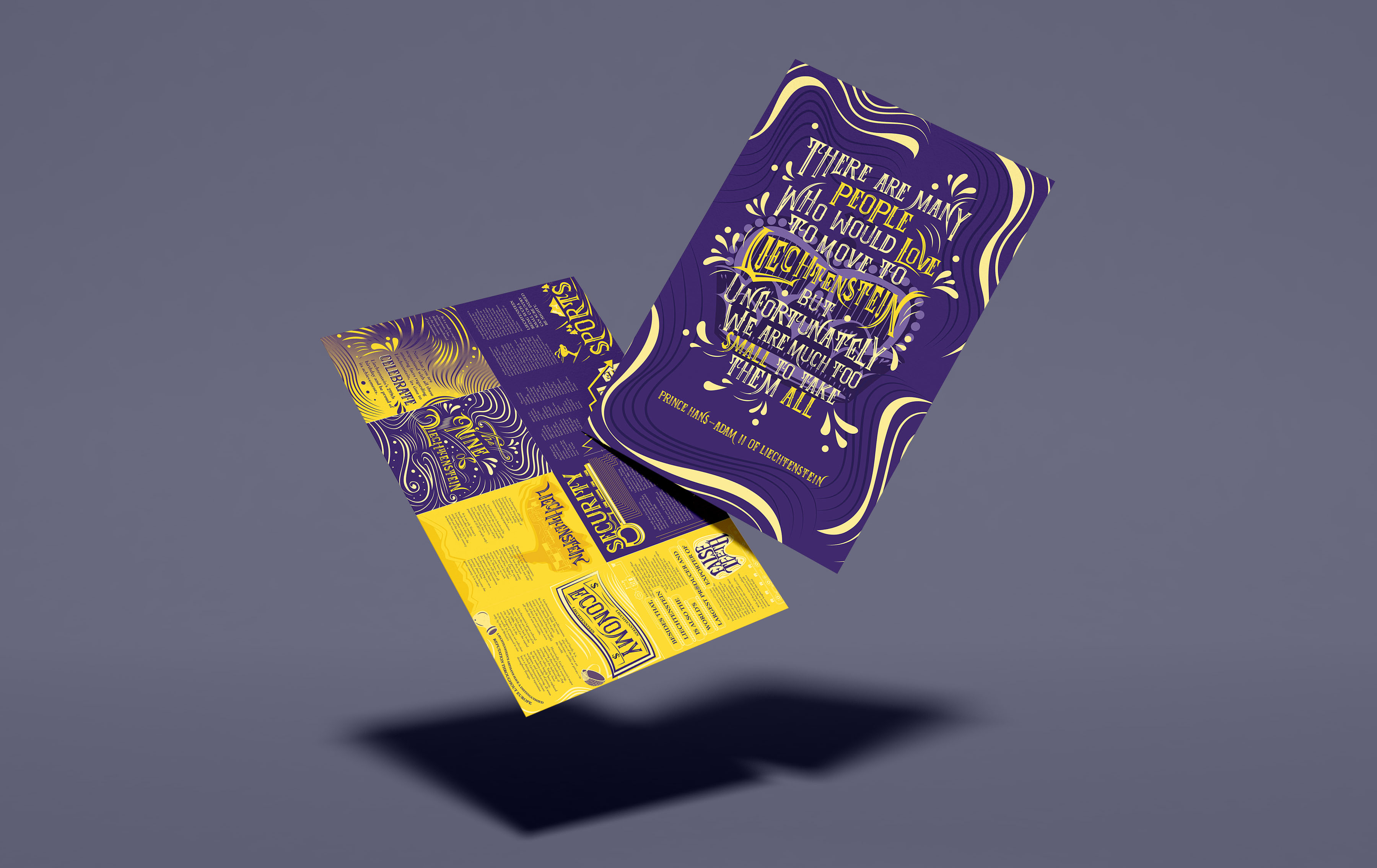
'The Nine of Liechtenstein' is a typography publication to promote the country, Liechtenstein through its unknown and interesting facts. The publication booklet opens up to reveal a poster at the back. It uses a self-drawn serif font to reflect the long history and medieval characteristic of the country. This publication features achievements of the country in terms of its economy, safety and sports.
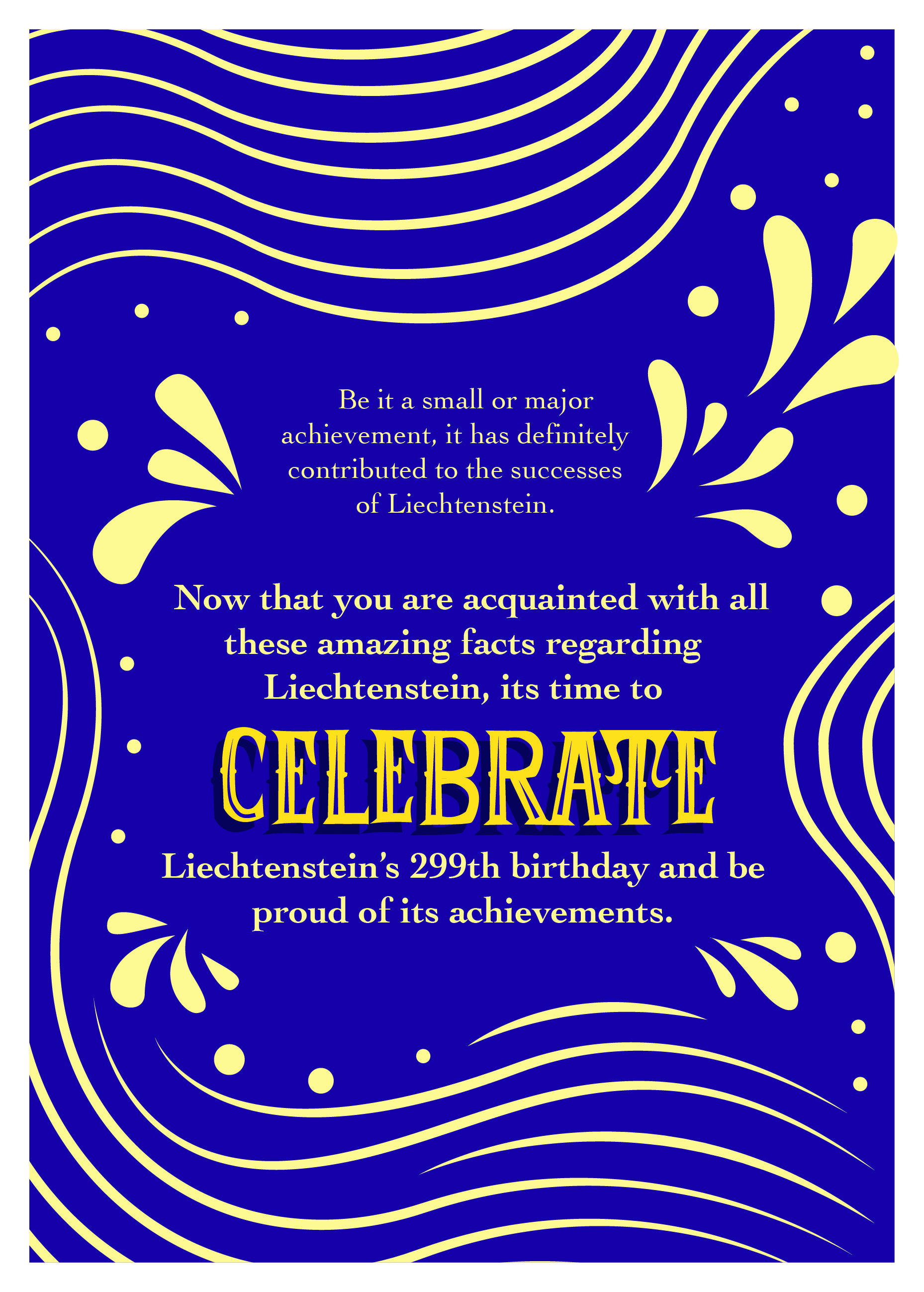
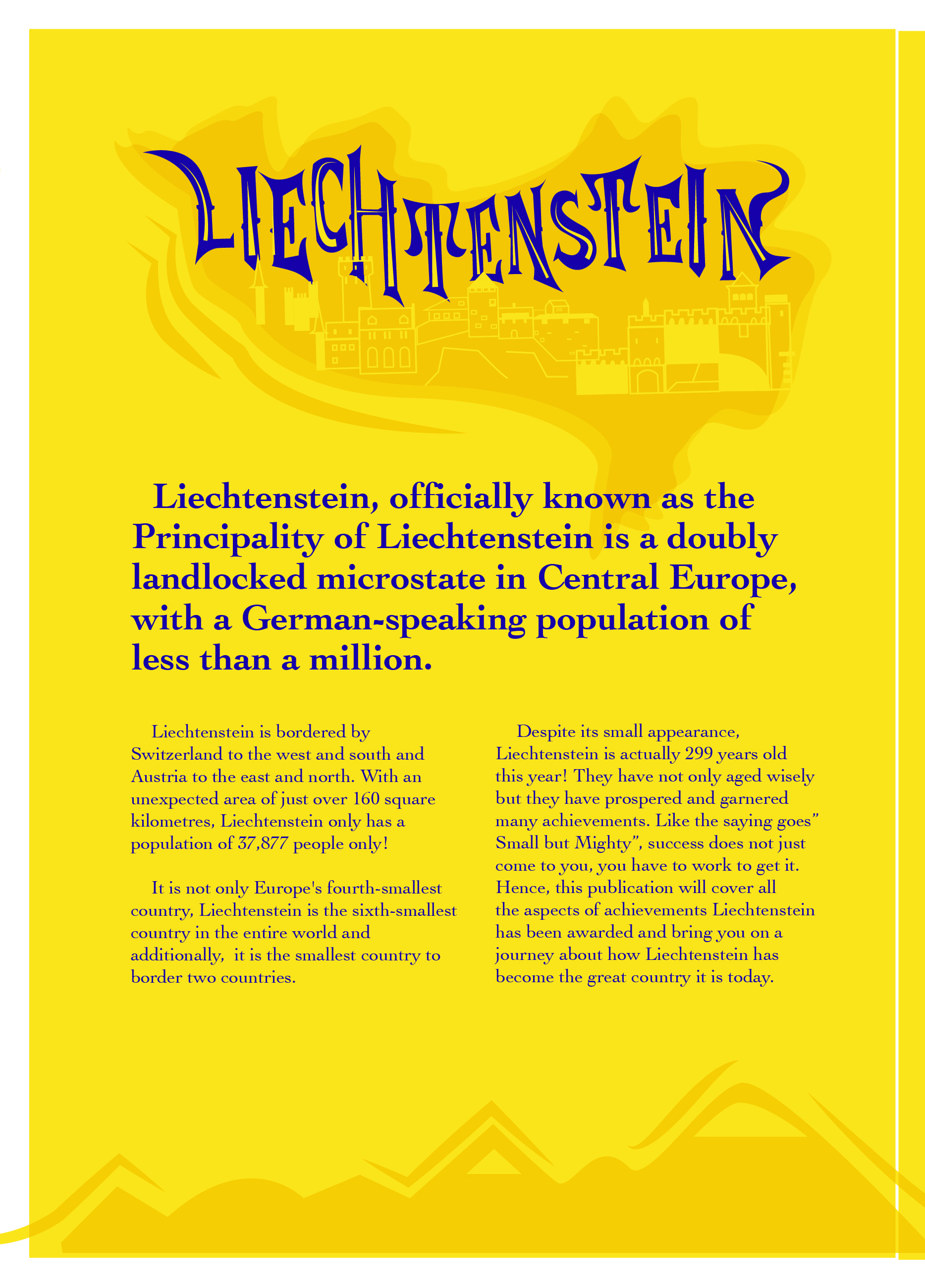
The intended purpose is to create a publication featuring the achievements of Liechtenstein. I thought of this idea as during my research, I found out that Liechtenstein’s royal family holds an annual party every year at their castle, inviting all of Liechtenstein’s people to gather and celebrate. Hence, I wanted to create this publication to educate the citizens about their country’s achievements and at the same time celebrate and honour their country together. As for the title of this publication, I named it “The Nine of Liechtenstein” as this year is Liechtenstein’s 299th birthday. Also, since this publication is intended to showcase the growth of Liechtenstein throughout the years, I included 9 interesting facts/achievements of the country so as to complement the age of the country as well.


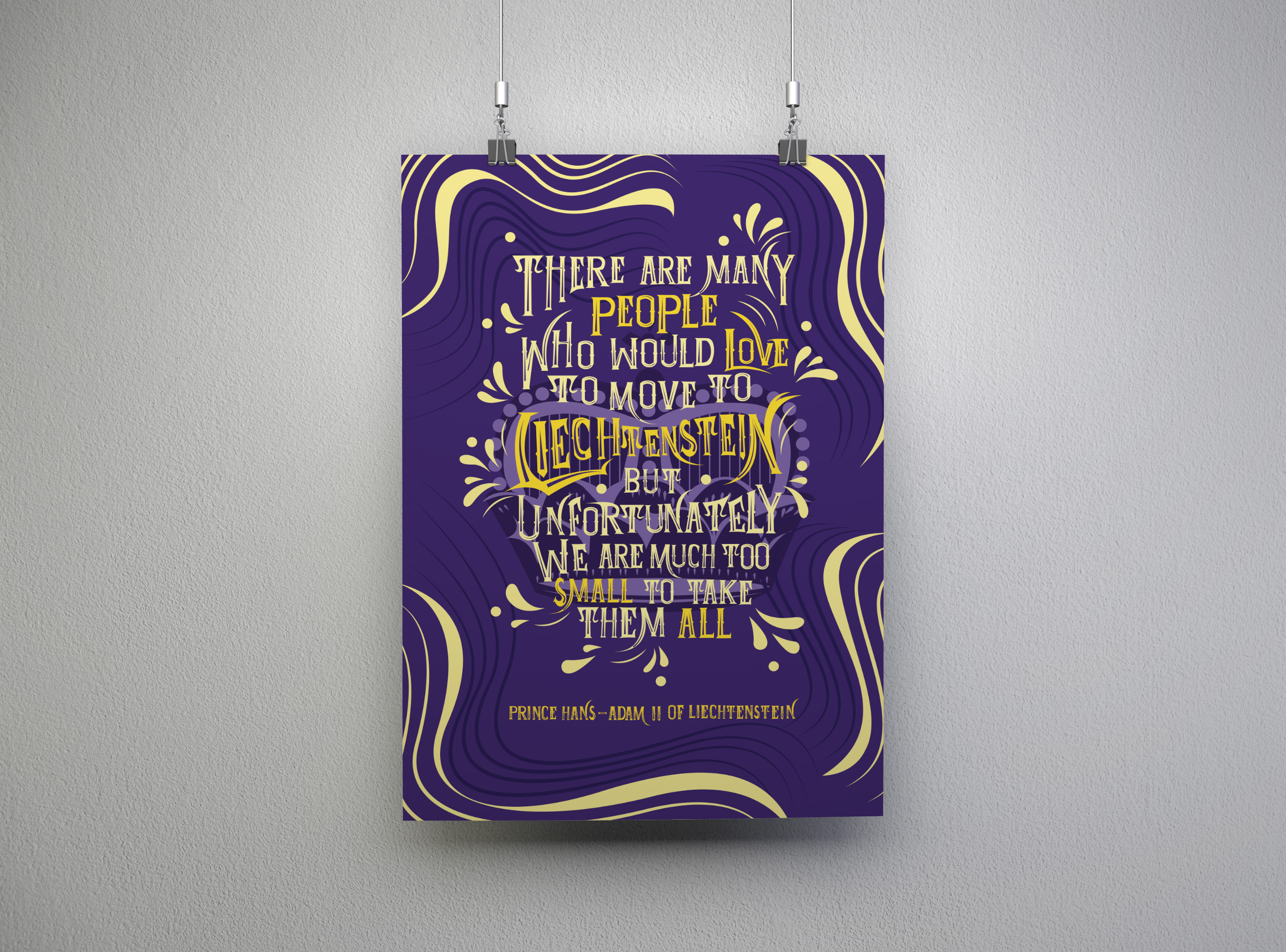
The back of the publication opens up to display a quote by a member of the royal family of Liechtenstein, since this publication is to celebrate and invite the people of Liechtenstein to the royal party. Hence, I intend to illustrate a graphic of the crown of Liechtenstein, which is commonly seen on the objects and flag of the country as well. Thus, the typography here will be to encase the crown, in this way as take the shape of the crown. Some alphabets will use its form to create the details of the crown and the others will form the outline of the crown itself. This would make the graphic and the text look mor e cohesive together.