Packaging Specifications:
Exterior Laminated 300 Gsm White Card - The outer box has a more glossy finish and does not have texture as texture does not go wel with printed graphics. A glossy surface would portray the visuals better.
Interior 200 Gsm Maxine Card - Having texture paper on the inside gives the tabs an easier grip.
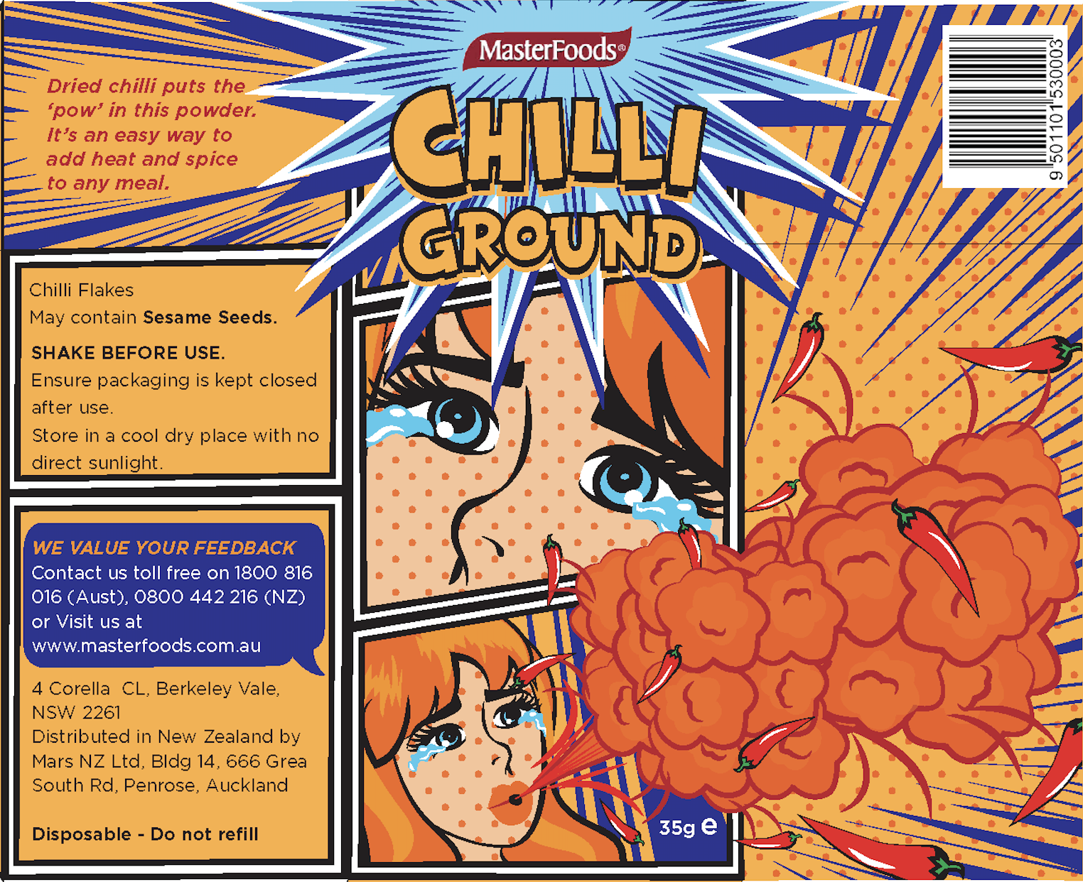
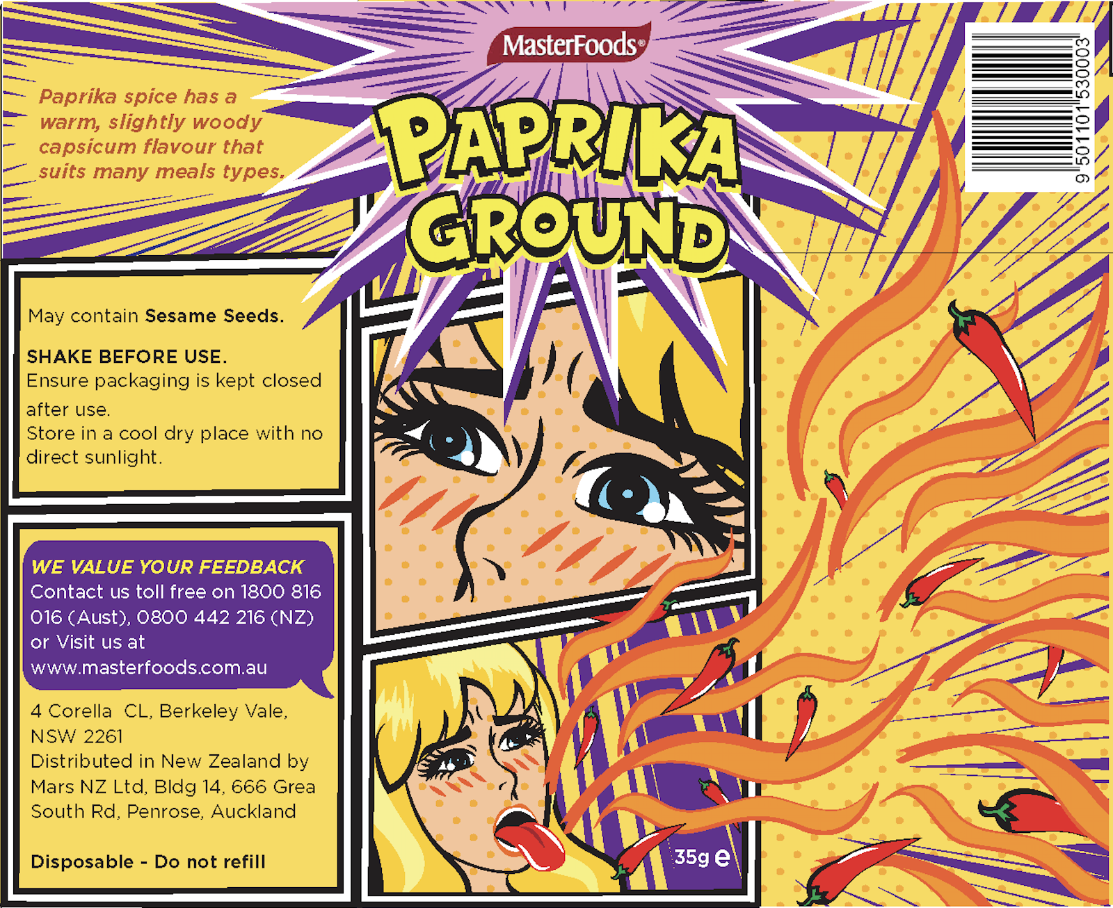
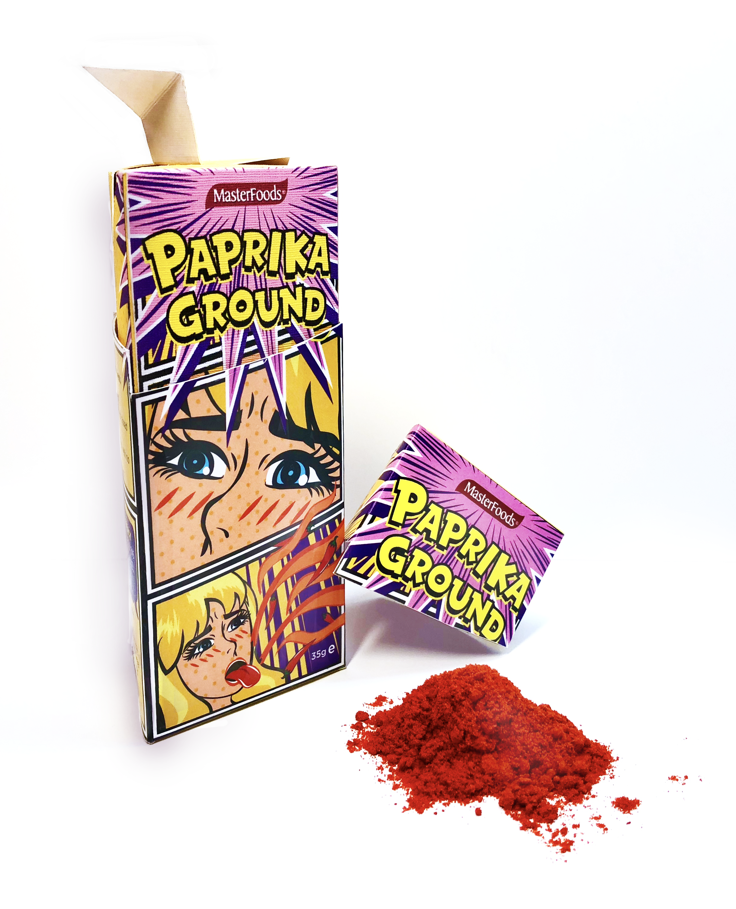
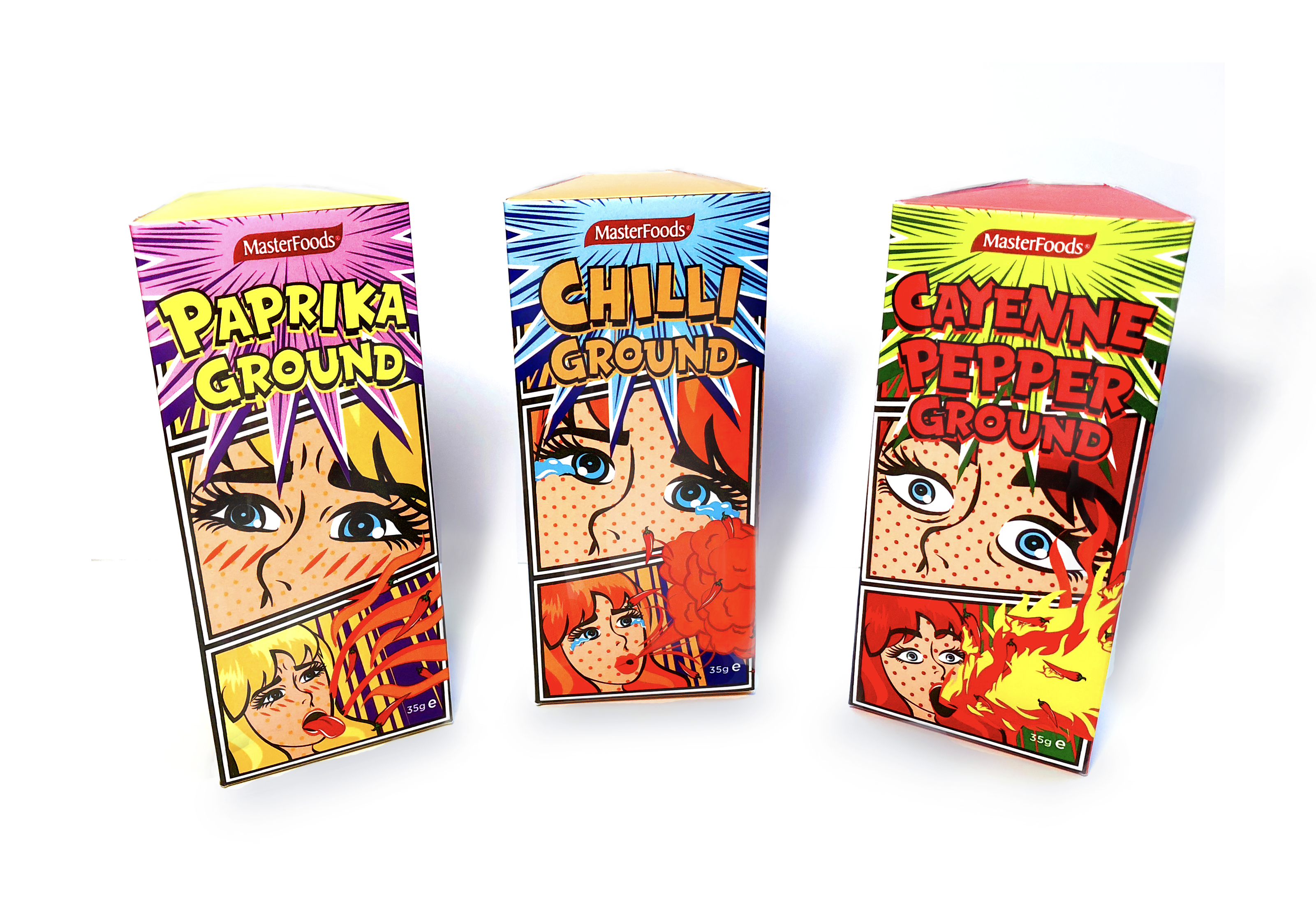
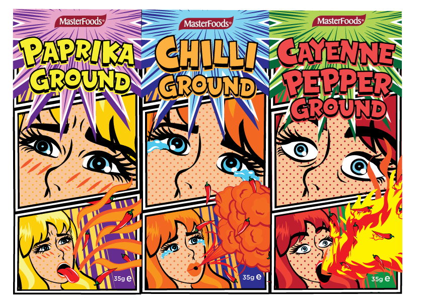
This is a packaging series for F&B brand, MasterFoods. I decided to go with pop art style as it reflects the burst of taste that these spices bring to dishes as both pop art and chilli share the same strong characteristics.The colours yellow, orange and red acts as a reference for customers to tell the level of heat of each chilli. The spiciness can also be interpreted through the expression of each character.
I differentiated the three series based on the facial expressions the characters make when they eat the peppers. Their facial expression will not only inform the customers on the heat level of the pepper itself but also humor them simultaneously. Additionally, colours were used to represent the heat level of the peppers which also played a role in differentiating the packagings. The least spicy was yellow, followed by orange and red was the spiciest according to the Scoville heat level. Visuals and text information are laid out in comic frames to further emphasize the theme and create a harmonious packaging.
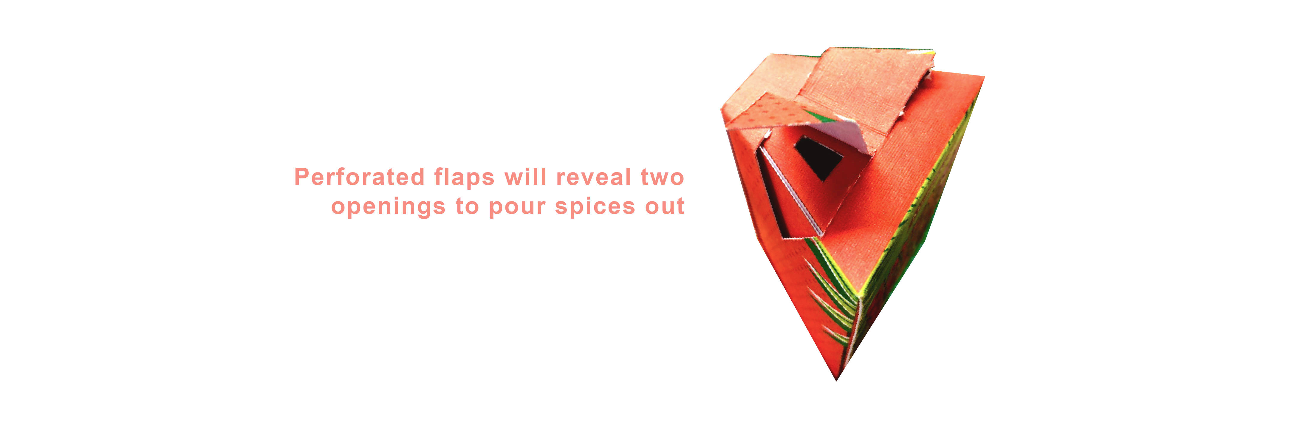
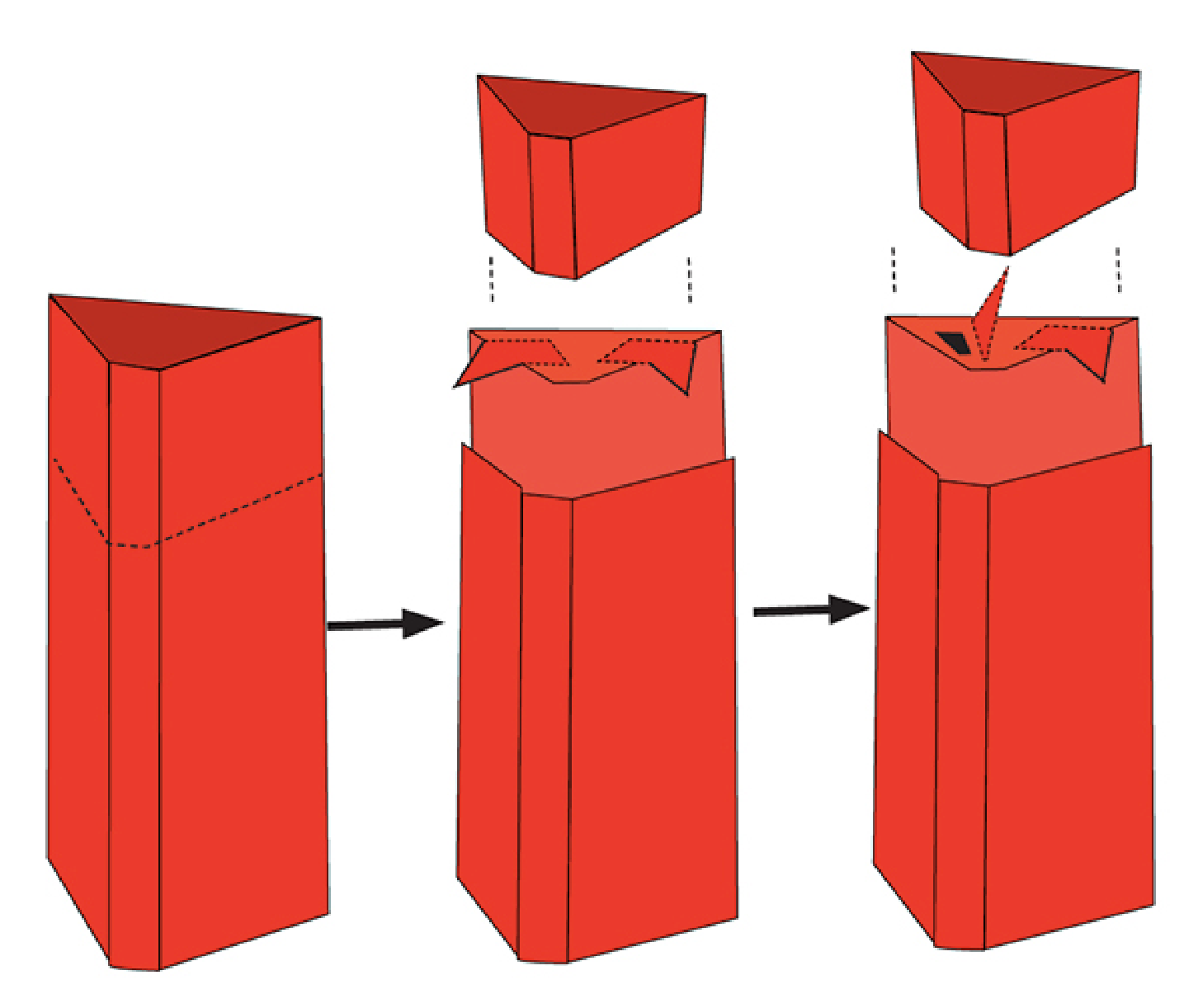
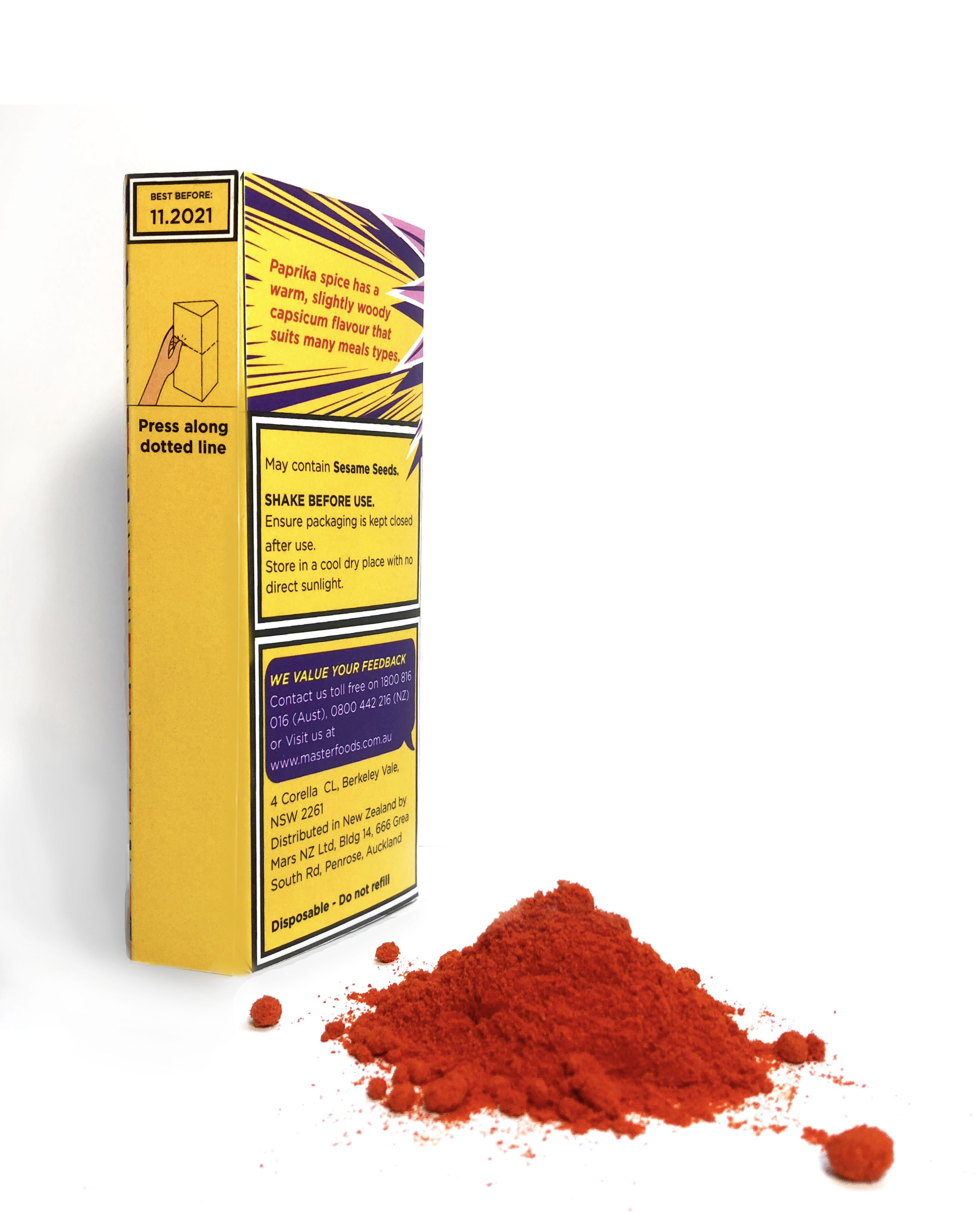
Having the design applied onto the text content also makes the reading process more entertaining as if it were comic narrations. Furthermore, I added in a snippet describing the taste and flavours of the peppers, as I feel that this overview will be appropriate and helpful to users who want to know more about the product and its level of heat. Instructions are placed at the perforation line on the outer packaging to show users how to properly open the cap. Then, on the inside, there are signs “Pull tab to open” on the flaps to tell them where to break the seal.