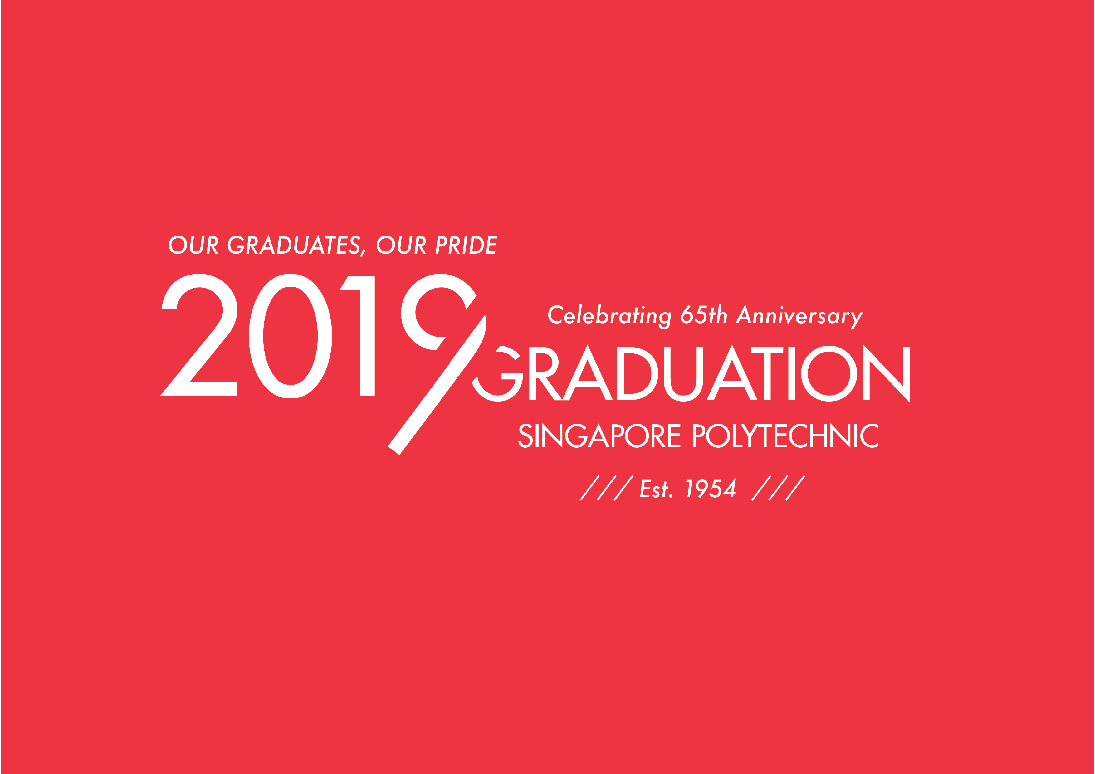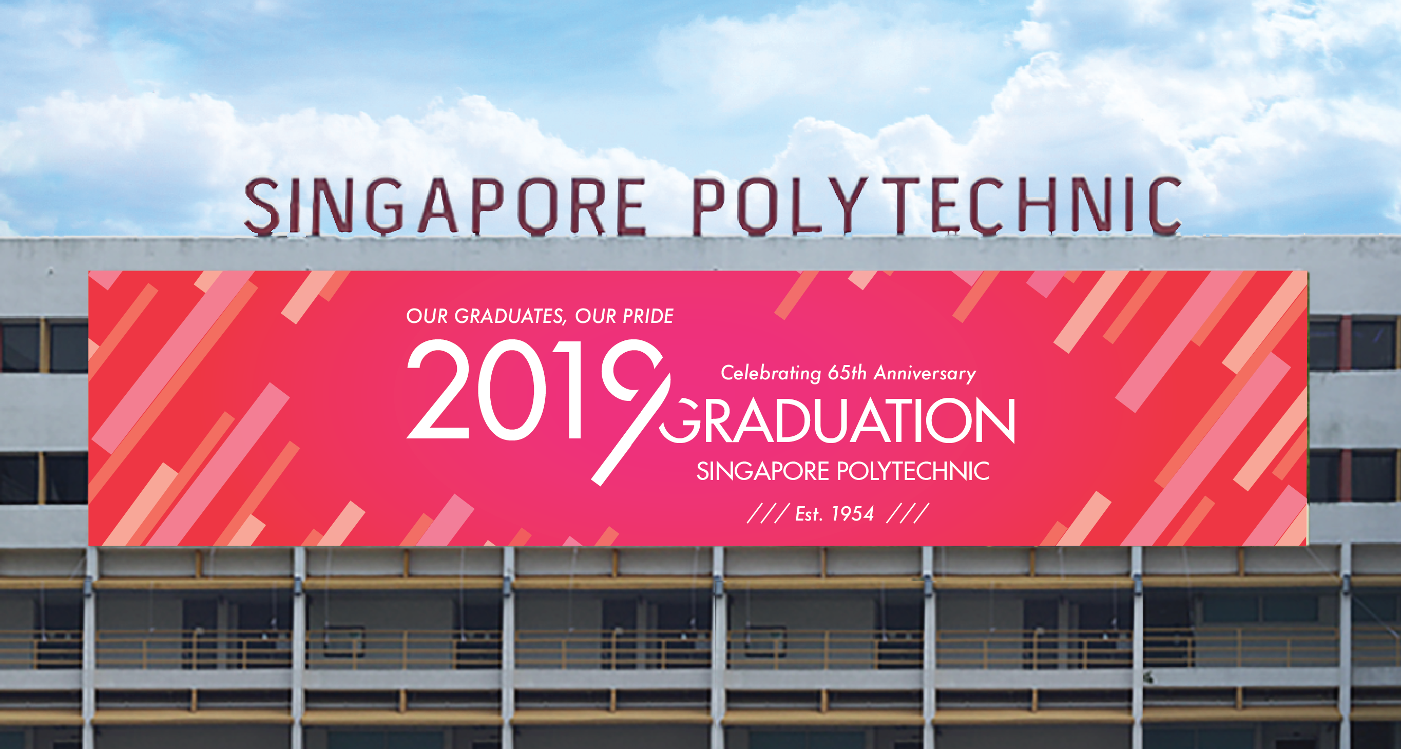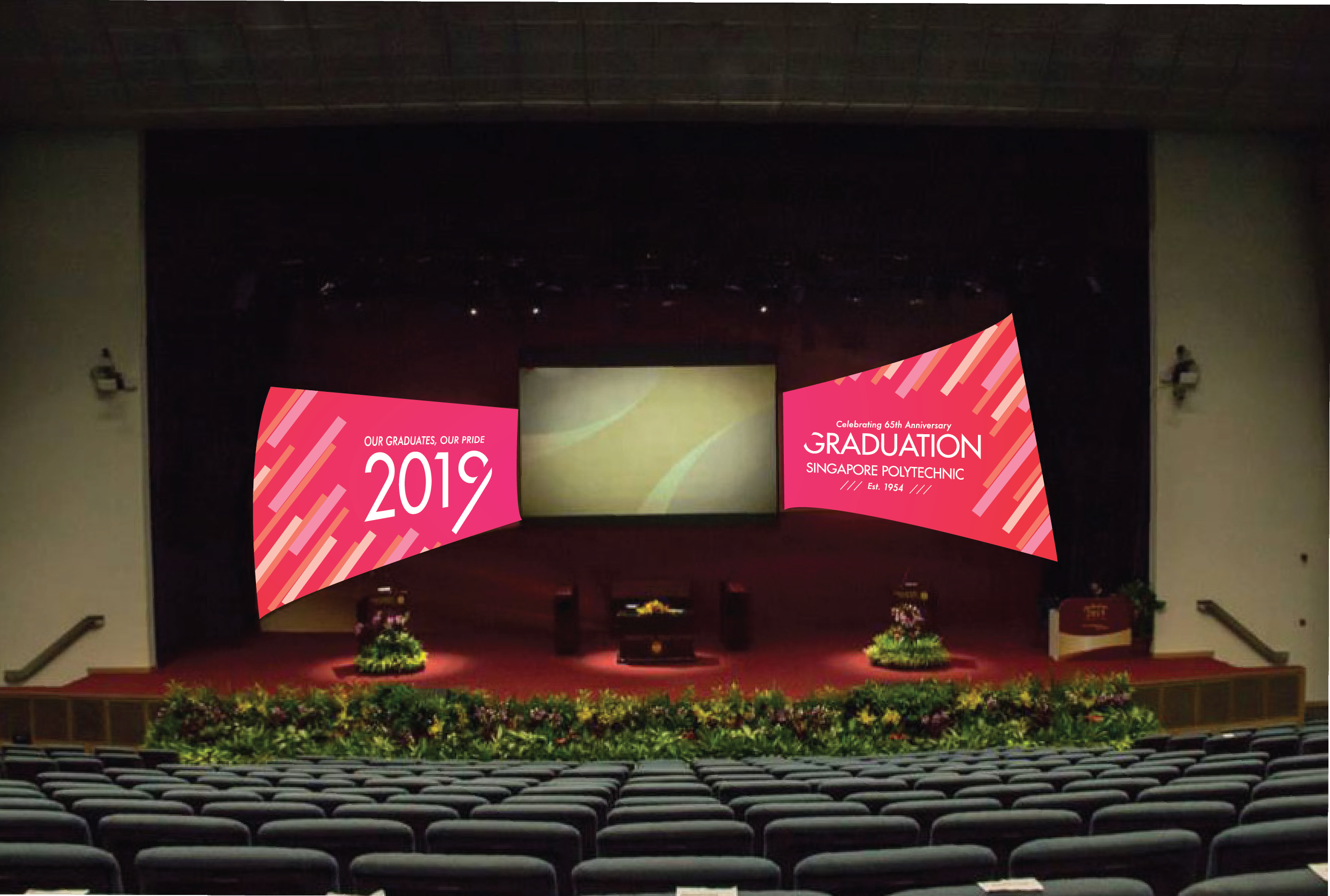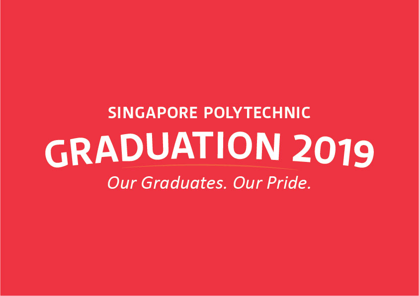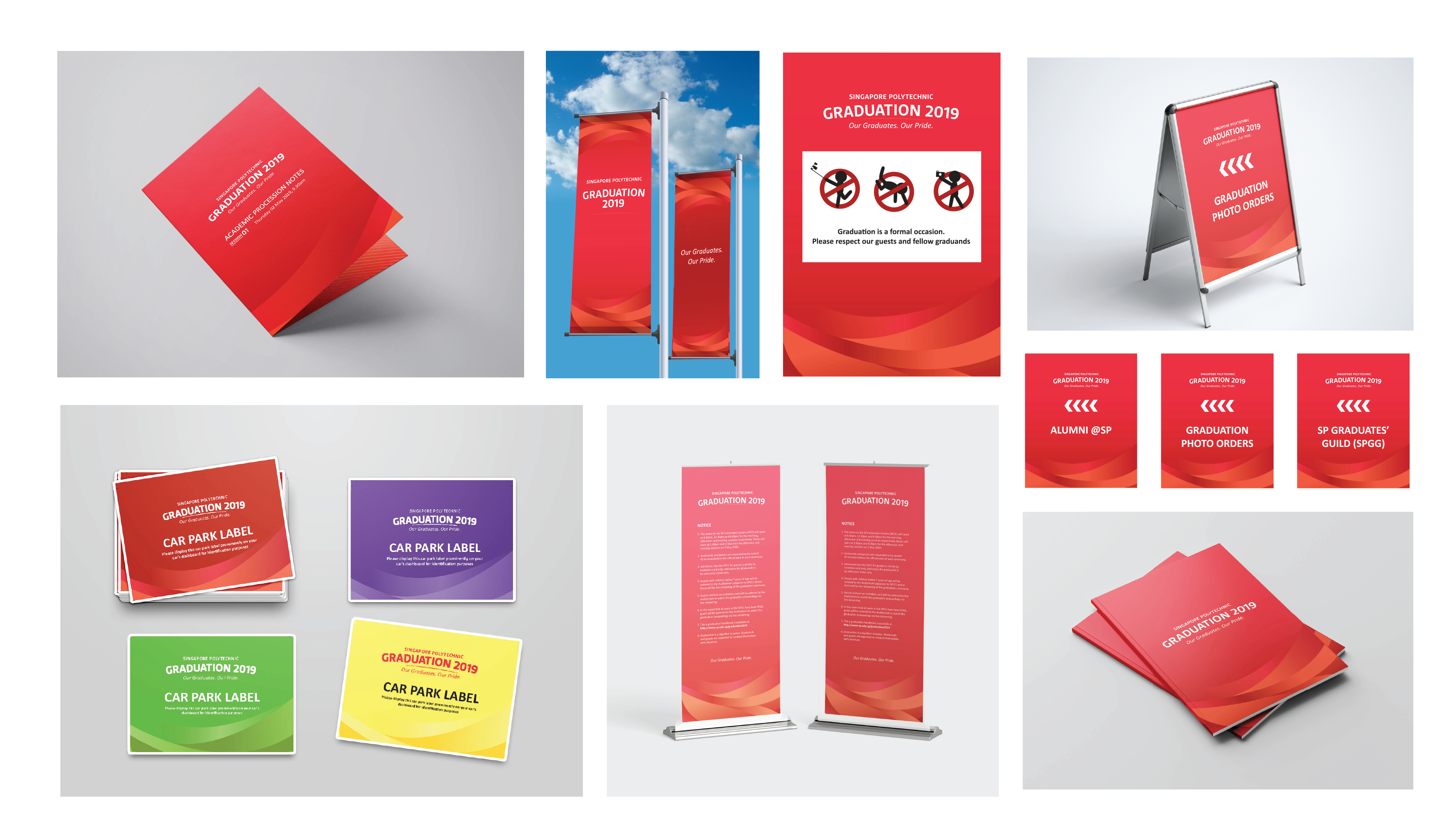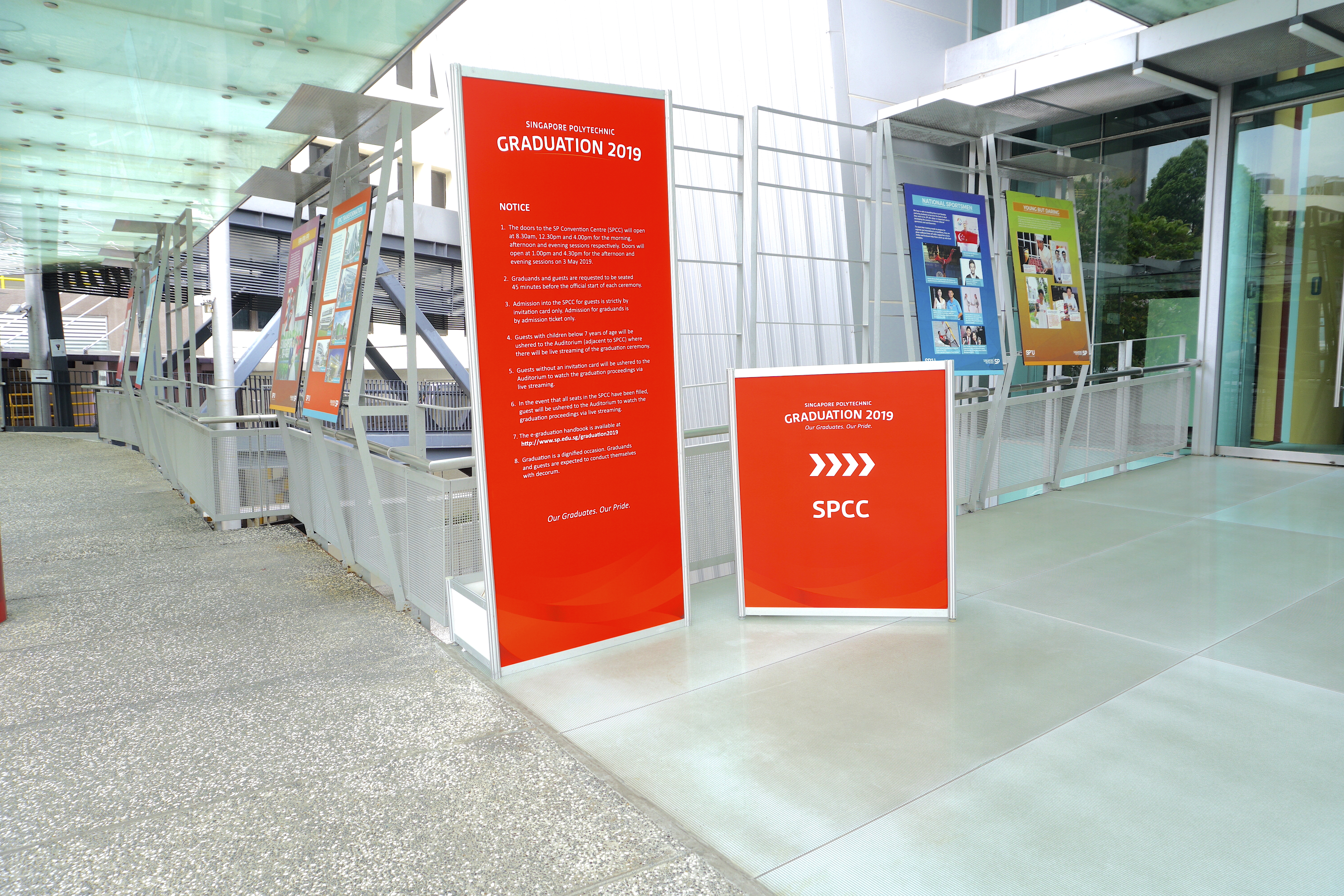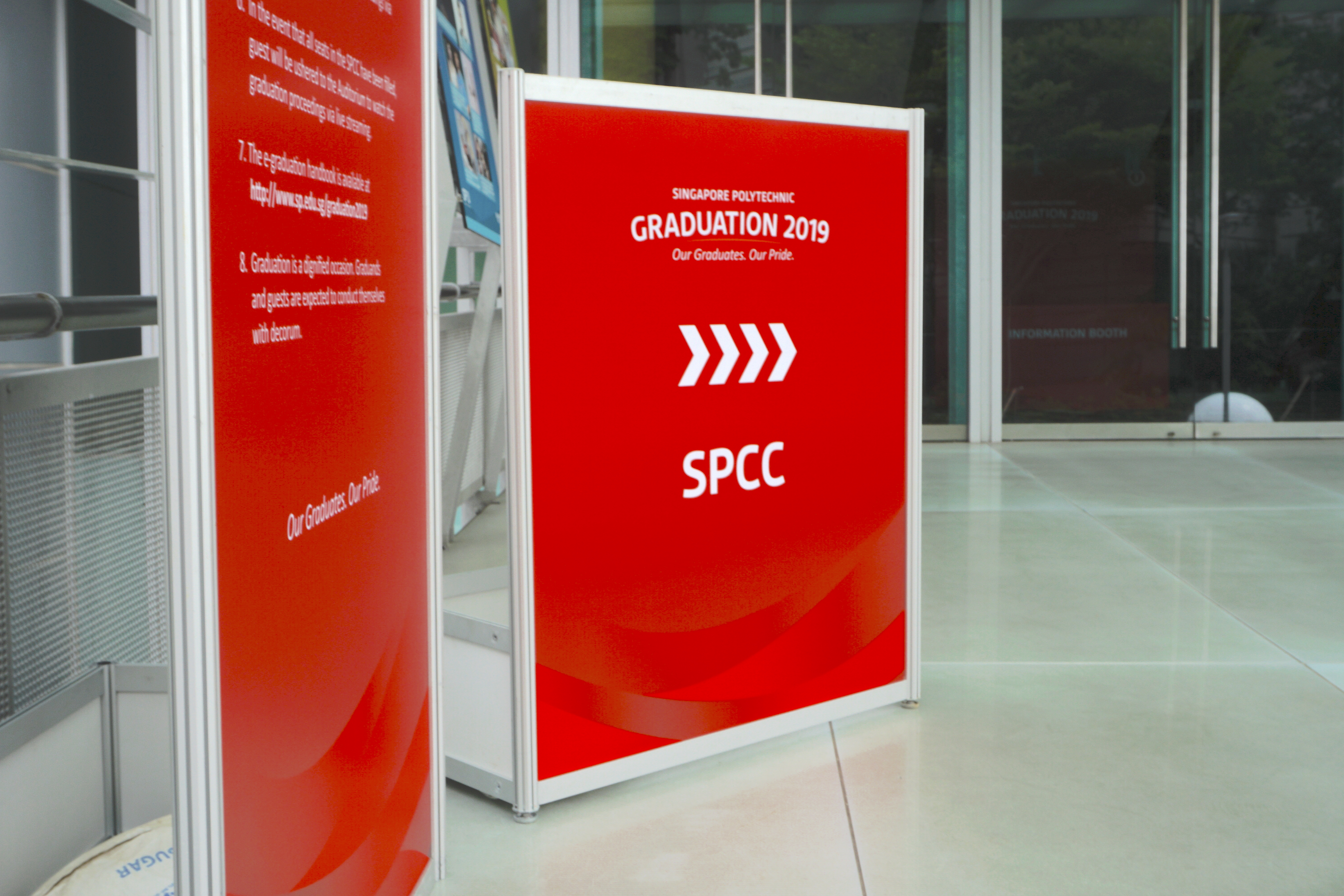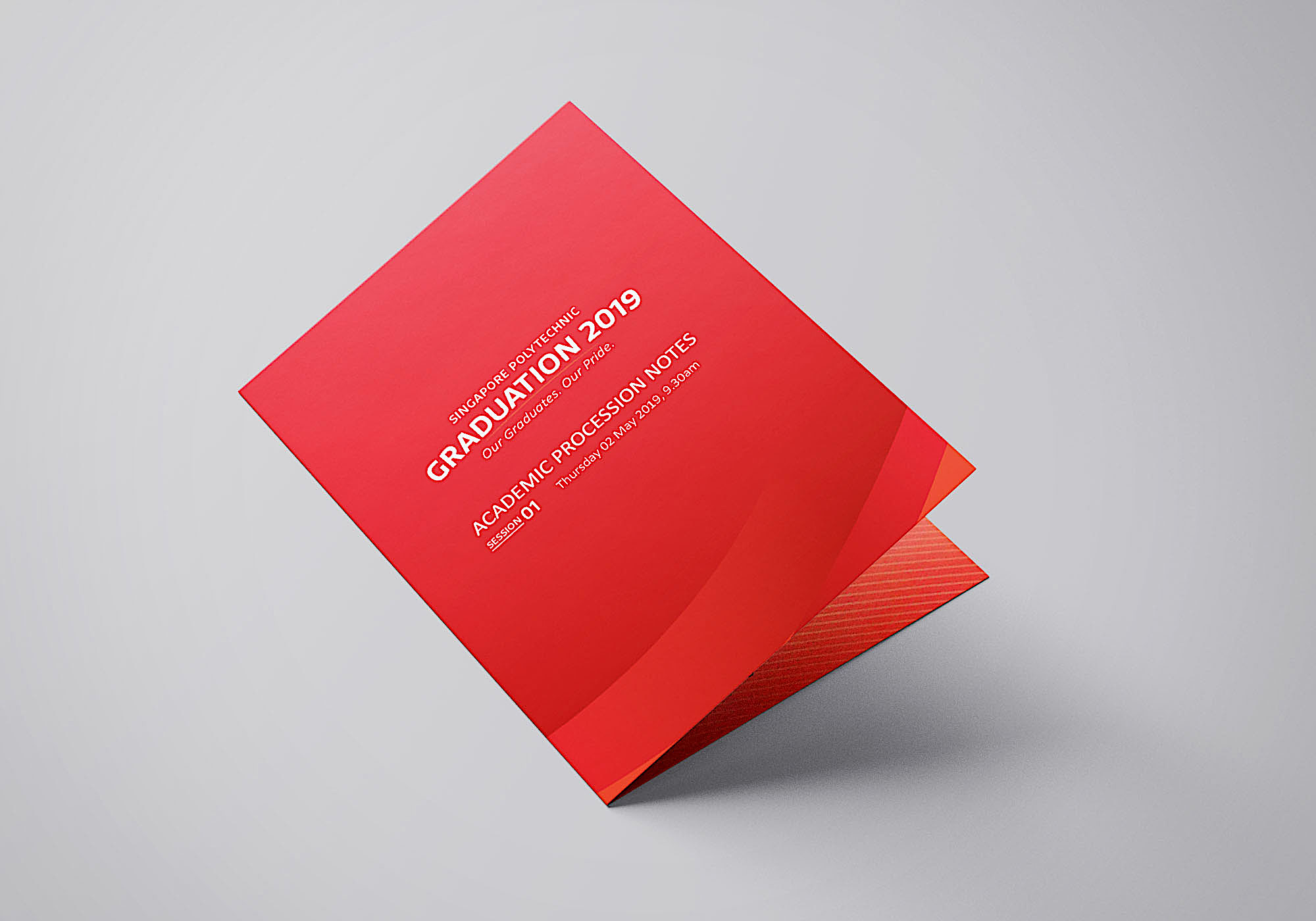
Being part of the design team in charge of the 2019 Graduation Ceremony for Singapore Polytechnic, I was tasked to propose and lead the art direction for the graduation ceremony's event design. Below is the art direction/ design concept I have proposed to the board of directors of Singapore Polytechnic. This design provides them with a more modern take on the typical graduation ceremony theme. The logo is sans-serif for better legibility on both large and small scale adaptations. There is a part of ‘2019’ and ‘GRADUATION’ that was cut off. This is to represent how graduation is not the end of a student’s journey in learning, as even with the imperfection in the words, the texts can still be read perfectly as whole which represents the achievement the students have gained instead. The lines bordering the texts are inspired from the cut in “2019”. The lines are angled and arranged in one direction so as to create a swift movement in the banner. Furthermore, the elements have a 45 degree tilt to symbolise the forward advancement and optimistic future of the graduates. This makes the banner look more energetic and friendly together with the bright/warm colours.